Monday, December 21, 2015


By Graciela, Art 3
For this project I had to experiment with watercolor and try different watercolor techniques. I also had to demonstrate multiple techniques in my painting. I chose to draw a face because I really like drawing people and I wanted to make it a little bit more challenging. I drew her looking down and, I chose cool colors because I wanted to create a sad feeling. I decided to paint her hair colorful to make it stand out. I wanted her hair to be the focal point of the painting. I wanted to incorporate other watercolor techniques and create a really cool background showing new techniques I learned, but one problem that I had was her hair. Her hair started to blend in with the background so that's why I chose a background that was more simple.

Sunday, December 13, 2015

Personal Critiques written by Art 2 Students


Matryoshka by Dianna, Art 2
This is an abstract painting that I recently made called ‘Matryoshka’ after the Russian Dolls. The medium is acrylic paint.

When I was making this project, I just wanted to quit and not even turn it in. I listened to various songs and looked up abstract painting techniques. I wanted a neon, crazy looking abstract vibe/feeling to it, but it really didn't come off that way. I used bright neon colors and mixed up colors too. I wanted to be like the professionals, but this is my first abstract project.Planning carefully, I didn't want a focal point anywhere in my painting. I wanted the viewer to look everywhere, and to be confused trying to figure out exactly what they’re looking at.

By Jeannette, Art 2
I created this artwork using ink pens. It features zentangle, micrography, and stippling. I feel I could’ve stippled the hair more. The lines of words by the sun and moon, I could’ve made it more straight. I forgot to shade the other sleeve, but I think it works out. I made this whole piece while thinking about opposites, everything that is good and bad. So I titled this piece, Opposing Sides. Most of my micrography has something to deal with opposites, but some of it contains parts of my pen name I created for myself.


Success  by Japreme, Art 2
 The objective of this project was to create a linear perspective drawing with accurate shading. I think I did well on most of the project. However, I think I could’ve shaded a little better. Other than the shading, I believe my project was very good. As you can see it clearly says “You’re on the road to success.” I did the project this way because it’s true. In high school we are all on a road to success by becoming successful people after high school and or after college. It’s something that I thought people should see to motivate people to get on the road to success if not already.

Abstract painting by Daequan, Art 2
In this abstract painting, I used blue, red, orange, green, purple, yellow, and black. While painting the project, I was trying to be a little creative because in most of my artwork, I never try to be creative or actually try to complete it. The reason I did some designs was because I probably liked the colors and I thought people would appreciate the creativity behind it.

I was unsuccessful because I tried too hard to make it creative and I messed up a lot of times where you could actually tell that I messed up, so I think I should’ve planned it better, or while I was doing it I should’ve thought harder about the colors I used. I was also unsuccessful because of where I painted most of the stuff. For example, I think some of the stuff I painted should’ve been in different places or smaller.

I think I will get a bad grade on this painting just because it’s bad, and I definitely could of done better, but I chose to rush because I wanted to hurry up and get it finished. 

Thursday, December 10, 2015

Student Critiques of their Work: Art 4

Artwork by Daniel, Art 4

This project was really interesting to do because it meant something to me personally when I was younger. To make this project I wanted to use different mediums to resemble the things you would normally see these objects as. I made the twitter page in the computer by making a template of how a comment would look like on a mobile device. The sky is painted using different values of blue and the poop emoji is made from colored pencil.
            From the start, we were asked to make a piece of art that would represent/have meaning on a social issue that is going on across the world. For example, global warming, bullying, and abortion are just few of many issues that we see every day on the news. The meaning behind my piece however, relates to me because I was a person affected by a bully on social media. Back when I was in middle school, I was normally picked on as a person who would be polite and caring to both my teachers and fellow peers. I was sometimes referred to as the teacher's pet because I loved helping my teachers out in any way I could. Most of the time, I would spend time focusing on assignments that were being assigned to us at the beginning of class and not worrying of others, but this all changed.
            When I first made a social media account I did not know what to expect from it, but as time went on I learned a very valuable lesson. This lesson was: friends can sometimes become your enemies and begin to have hatred for you. As the school year went on, I got picked on and when people said negative comments, I tended to get upset. This process of me being a victim of cyberbullying has made an impact in my life where I grew strong and accepted what others had said about me. People can say things to others and hurt you along the way, but if you have the right mindset and you don't care what others say, you can be a unique person. ​

            I chose to do this issue on cyber bullying because every day thousands of teens are getting bullied on a social media pages whether they are a little kid or a grown adult. Being bullied is not something that should be taken as a joke because teens have the highest rate of suicide as of right now because they are being bullied. ​I struggled to overcome this obstacle in middle school, but that did not stop me from continuing on in what I like to do best.
Queen of Hearts Critique, Josh, Art 4
“Revenge that comes from the Heart” is a mixed media piece created with watercolor and color pencil on watercolor paper. The subject matter of this is the Queen of Hearts and she is holding Alice’s head. The objective for this piece was to create an original character or create an original version of a character.

I created my own design for the Queen of hearts by changing her clothing and her hair style. Her outfit is red and black with a gold belt. The background and the edges are in different shades of brown and there red and black “Q”’s that are opposite of each other. The queen is holding up Alice’s bloody head and there are blood stains everywhere.

Tuesday, December 08, 2015

Student Critiques of Their Work: Art 3

Briana by Auset, Art 3
Before we started this project, we looked at different techniques when using watercolor. I used blossoming and salt as my techniques in the background. We didn't have a specific objective or topic , but to just use watercolor in some way. This was a portrait of my favorite youtuber, Briana Hall a.k.a. SmartistaBeauty. Something i would've done differently was used another medium such as pen or graphite to draw her then just paint in the areas. Something i liked about watercolor was that you can do different things with it to accomplish any look. Even though it's not my first time using watercolor, i wasn't aware of the different techniques. It's versatile and gives you many options.


A Jolly Day Before Halloween by Julie, Art 3
This work was inspired by The Nightmare Before Christmas, and the idea came to me from a fellow classmate. Since it was my favorite movie and very close to Halloween, I decided to roll with that idea. I used Acrylics on Santa and Jack and water colors for the background. The background is meant to represent Christmas and Halloween. I think that this was also successful in the sense that it came out pretty nice. I tried to balance the background a bit with the main part, Santa and Jack. I think it kind of worked.

Sunday, December 06, 2015

Student Critiques of their Work: Art 2


Diamond  by Angel, Art 2
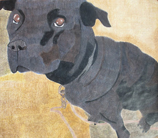
Hey my name is Angel, and this piece of artwork is of my dog and her name is Diamond. I created this piece of artwork with color pencil for a project for my art class. Overall, I liked how the dog turned out and how you can see the variation of color and value in her coat. I used blue, brown, and black color pencils to create the color of the dog. I personally feel that I could have made the background better by making the shades of brown similar. I don’t like how my background turned out because you can notice the different shades of brown that there are. If I had the chance to do this project again, I would test the colors on a separate sheet of paper to see if that’s the color I needed. Just to let the person know who is reading this that this was my first project using only color pencil. Feel free to give me feedback. :) 

Automatic Painting by Destiny, Art 2
 My Abstract Painting is made with pastel colors. I started with 3 sections using pink, blue and gray in one, turquoise and yellow with white in one, and all those colors in the middle. I then started to mix all the colors together to make a smooth surface of blended colors. After looking at it for a while, I decided to make it thick with texture so I put thick blobs of paint on and let it dry. Then, I put more thick blobs and spread it in little lines. Afterward, I used all the colors all over the canvas to make it look more unified.  


Automatic Painting by Seham, Art 2

I created my abstract art with paint. Also, in the beginning, I wasn’t sure what to do, even though with automatic painting you are not supposed to think about what you are doing, you just do it. I tried to use many colors that went together. One of the things I felt less successful on was that I used too much of the repetition of the same pattern, which I tried to change towards the end. Also, to make it look better, I drew lines to keep the project neat and to add some visual interest creating a variety of brushstrokes. In the beginning, I did not think I did that good of a job, but in the end it looked really good to me. In the corner I tried to draw something everyone knows, which is an emoji. I did not think I did well on that because you can see the texture of the white paint behind it, and I tried to fix it, but I could not. To make it look prettier to me, I added paint splatters and also I found a hard brush and made different patterns with them. Overall I think I did a very good job.

One Point Perspective Project by Cindy, Art 2
I made this  drawing with charcoal and graphite, and it was created on September 4th, 2015 at GHS. This linear perspective project depicts the Graham High School fine arts building. It was taken from a distance to show a one point perspective view of the hallway.

The focal point of the drawing is the middle of the double doors. Everything in the drawing goes to the double doors, like the curtains, walls, and lights. The shading/blending technique was used throughout the whole drawing. There are darker values in different areas of the drawing, like in the curtains. The curtains have a darker value while the ceiling is a little bit lighter. The element of line is also present in the drawing. All of the walls and the ceiling have lines coming from them and they all meet at the focal point.

I think the drawing is successful. It is successful because it appears to be neat and the blending is good. The drawing is neat enough to see that it is a hallway. Overall I think it is a great drawing of the GHS fine arts building because I was able to draw it and all the walls and objects go to the focal point.