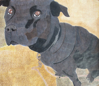
Diamond by Angel, Art 2
Hey my name is Angel, and this
piece of artwork is of my dog and her name is Diamond. I created this piece of
artwork with color pencil for a project for my art class. Overall, I liked how
the dog turned out and how you can see the variation of color and value in her
coat. I used blue, brown, and black color pencils to create the color of the
dog. I personally feel that I could have made the background better by making
the shades of brown similar. I don’t like how my background turned out because
you can notice the different shades of brown that there are. If I had the
chance to do this project again, I would test the colors on a separate sheet of
paper to see if that’s the color I needed. Just to let the person know who is
reading this that this was my first project using only color pencil. Feel free
to give me feedback. :)
Automatic Painting by Destiny, Art 2
My Abstract Painting is made with
pastel colors. I started with 3 sections using pink, blue and gray in one, turquoise
and yellow with white in one, and all those colors in the middle. I then
started to mix all the colors together to make a smooth surface of blended
colors. After looking at it for a while, I decided to make it thick with
texture so I put thick blobs of paint on and let it dry. Then, I put more thick
blobs and spread it in little lines. Afterward, I used all the colors all over
the canvas to make it look more unified.
Automatic Painting by Seham, Art 2
I created my abstract art with paint. Also, in the beginning, I wasn’t
sure what to do, even though with automatic painting you are not supposed to
think about what you are doing, you just do it. I tried to use many colors that
went together. One of the things I felt less successful on was that I used too
much of the repetition of the same pattern, which I tried to change towards the
end. Also, to make it look better, I drew lines to keep the project neat and to add some visual interest creating a
variety of brushstrokes. In the beginning, I did not think I did that
good of a job, but in the end it looked really good to me. In the corner I
tried to draw something everyone knows, which is an emoji. I did not think I
did well on that because you can see the texture of the white paint behind it,
and I tried to fix it, but I could not. To make it look prettier to me, I added
paint splatters and also I found a hard brush and made different patterns with
them. Overall I think I did a very good job.

One Point Perspective Project by Cindy, Art 2
I made this drawing with
charcoal and graphite, and it was created on September 4th, 2015 at GHS. This
linear perspective project depicts the Graham High School fine arts building.
It was taken from a distance to show a one point perspective view of the
hallway.
The focal point of the drawing is the middle of the double doors.
Everything in the drawing goes to the double doors, like the curtains, walls,
and lights. The shading/blending technique was used throughout the whole
drawing. There are darker values in different areas of the drawing, like in the
curtains. The curtains have a darker value while the ceiling is a little bit
lighter. The element of line is also present in the drawing. All of the walls
and the ceiling have lines coming from them and they all meet at the focal
point.
I think the drawing is successful. It is successful because it
appears to be neat and the blending is good. The drawing is neat enough to see
that it is a hallway. Overall I think it is a great drawing of the GHS fine
arts building because I was able to draw it and all the walls and objects go to
the focal point.


