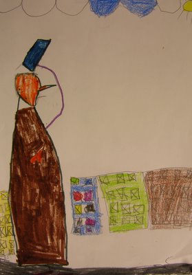
This picture was created by one of my 5-year old Kindergarteners. FIVE YEARS OLD!!!! They were learning about foreground and background and how things in the foreground are bigger and things get smaller when they get far away. You'd be surprised at how hard this concept is for them to grasp, but I thought that the little girl that made this did a pretty good job. To clear any possible confusion, she has drawn a picture of a man walking down the street in the process of taking off his hat. The buildings in the background were drawn smaller, proving that she understood the concept- Now we just need to work on the fact that buildings sit on the street and don't float in the air. I love the extremely confident line quality that you get in drawings done by children that are so young, and I'm sure this will be the first of many pictures I'll share with you.

3 comments:
hello. . . i watched it!!! i don't have any more fingernails!
why are all the windows x'd out? that was obviously intentional, so it must mean something. maybe there's a hurricane coming, and that's ducktape. home depot always runs out of plywood when there's a hurricane coming. and do you have this girl's permission to post her artwork?
by the way, i went to my nephew's 5th birthday party this past weekend, and i met his girlfriend who he doesn't like people to call his girlfriend, and she looks just like you did when you were a little kid.
i'm sorry, i just am not blown away by this piece. the artist has no concept of spacial balance, and while she does present a figure using confident line quality (as you pointed out), the overall composition lacks cohesiveness.
yes, i get that this is a political statement about the blue collar man during the age of the great depression. yes, i get the significance of the two solitary clouds, which represent the figure's two surviving children amongst the five who have died from pneumonia. and yes, i get why he is shrouded in brown, which is to symbolize his inability to cope with the ever-changing economical failures that existed so prominently in the early 1940s. could the artist be a little less nondescript?
indeed, the artist tells a story with this ambitious piece with magic marker and crayon. she obviously has a firm grasp on the struggles and hardships that were prevalent during the depression. and while she does lack in composition and structure, she make up for it with an ingenious use of color.
like the sun peaking through in the world of the figure, desperately trying to shine on a world of devastation and hunger and loss, so too does this artwork peak through the clouds of the post-modern art world. there is so much ambition and determination living inside the soul of this piece. in fact, if i had to describe it in one word, i would say "soulful."
regardless of the technical errors made, and perhaps in spite of them, i tip my blue hat to you, young artist.
Post a Comment